Are my captions actually readable?
Most of your viewers watch on mute, on a phone, in bad light. If your captions are too small, too low-contrast, or changing too fast, the video is failing for the people most likely to share it. Here is how to check.
lengththe real test
By Thomas, founder of CutScore · Published · Updated
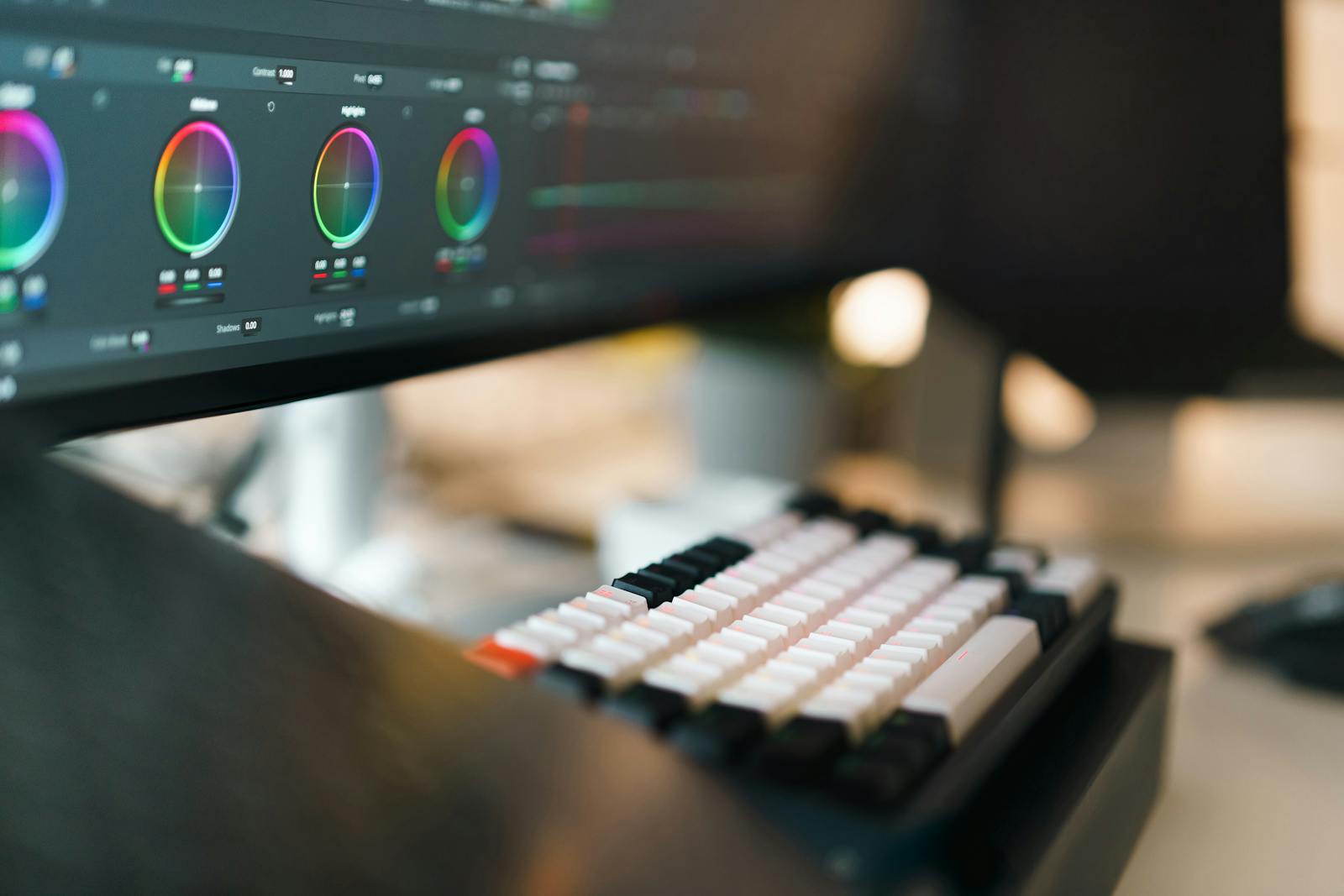
Here is the trap. You read your own captions on a big bright laptop, sitting close, with the audio playing, while already knowing every word that is about to appear. Of course they look fine. You are not reading them. You are confirming a sentence you wrote three hours ago. The text could be half the size it needs to be and you would never feel it.
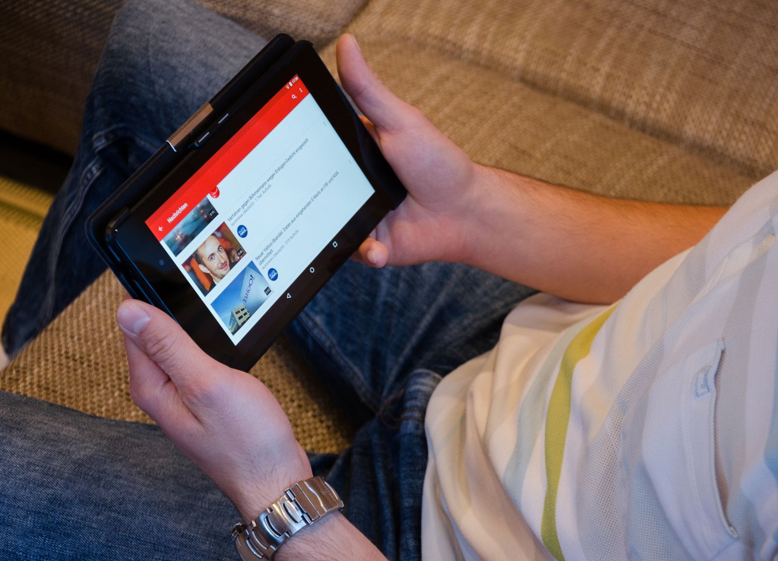
Your viewer has none of that. They are on a phone the size of a playing card, one hand, maybe on a train, in sunlight that turns the screen into a mirror. A huge share of them have the sound off, scrolling past in near silence. For that person the captions are not a nice extra. They are the video. If the words are too small or they vanish into a white sky for two seconds, your viewer does not squint and persevere. They flick to the next clip.
I have shipped clips with captions I was sure were big enough, then opened them on my own phone outside and could not read my own words. So this is not a lecture, it is a confession with a fix attached. Readability is not a taste call. It has targets, and they are short.
What makes a caption readable.
Five properties carry almost all of it. Each one has a target you can check by eye, and each one is something a viewer notices the instant it fails.
| Property | Target to hit | What goes wrong if you skip it |
|---|---|---|
| Size | ≈ 4–6% frame height | Too small and mobile viewers cannot read it before the line changes. |
| Contrast | backing or outline | White text alone disappears the moment the shot behind it goes bright. |
| Line count | 1–2 lines, short | Three packed lines is a wall of text nobody finishes mid-scroll. |
| Timing | readable, then change | Captions that flick by faster than you can read them are worse than none. |
| Placement | inside the safe zone | Text under the platform's buttons gets covered and partly cut off. |
Checking caption size, contrast and timing frame by frame is slow. CutScore measures all five on every line and hands back the timestamps that fail, so you fix the text instead of inspecting it.
Are my captions readable, line by line.
1. Size: read it on a phone, not a laptop
The single most useful test costs nothing. Put the video on your phone, hold it at arm's length, and try to read a line in one glance. If you lean in, the text is too small. As a working target, caption text wants to be roughly 4 to 6 percent of the frame height, so on a 1080-tall vertical video that is around 45 to 65 pixels of letter. Bigger rarely hurts on mobile. Too small almost always loses someone. The same logic feeds into what we analyze, because on-screen text is read before a single word is heard.
2. Contrast: survive a white sky and a dark doorway
White text looks safe until your shot turns white. A snow scene, an overcast sky, a bright shirt, and suddenly the words are gone for two seconds. The fix is to stop relying on the text colour alone. Give the captions a solid or semi-solid backing box, a thick outline, or a soft drop shadow so they read over anything moving behind them. If you want a number, aim for clearly more than 4.5 to 1 contrast between the text and whatever is behind it at the worst frame, not the easiest one. You can check text contrast in your video in the same pass you check the captions.
3. Length: two lines, short, in plain language
A caption is not a transcript dump. Keep it to one or two short lines on screen at a time, and break the line where a person would naturally pause for breath. Three dense lines is a paragraph, and nobody stops mid-scroll to read a paragraph. If a sentence is long, split it across two cards rather than cramming it. Shorter lines also mean bigger text fits without touching the edges, so length and size quietly help each other.
4. Timing: long enough to actually read
Captions that change faster than you can read them are worse than no captions, because they tease information and then snatch it away. Each card needs to stay up long enough to read at a calm pace, with a beat of breathing room. Karaoke-style word-by-word highlighting can look slick, but if the whole line never sits still, slower readers and non-native speakers lose it. The honest test is the same one again: can you, a stranger to this clip, read every card the first time through?
5. Placement: keep it clear of the interface
This is the one that survives the edit and dies on the platform. On vertical video the bottom roughly 15 to 20 percent of the frame is buried under the platform caption, your username, and the row of action buttons. Park your text down there and it gets covered, or partly cut off, on the exact apps it was made for. Keep captions in the middle band, inside the safe zone, then preview inside the real app before you decide it is fine. The desktop preview is not the truth. The phone in your hand is.
Here is a real CutScore coaching report for an everyday reel: caption size, contrast, timing and safe zones, scored, with the exact timestamps that need a fix.
If you only fix three things.
Most of the jump from "unreadable on mobile" to "anyone can follow it on mute" comes from these three. Fix them first.
By eye, by device, or in one pass.
By eye on your editor
Free, and the least reliable. The big bright preview flatters small, low-contrast text, and you already know every word, so you cannot read your captions like a stranger would. Better than nothing, but it is the version that quietly lets unreadable text through.
On a real phone, on mute
The honest manual method. Send the clip to your phone, turn the sound off, and read it at arm's length in normal daylight. You will catch size and contrast problems fast. The cost is doing it carefully on every single clip, and remembering to preview inside the real app for safe zones.
With a coach in one pass
Hand the file (or a link) to CutScore. It measures caption size, contrast, line count, timing and safe zones across the whole video, and gives you a 0 to 100 score with the exact timestamps that fail and the fix for each. See a sample report.
Frequently asked.
Stop guessing whether anyone can read it.
CutScore checks caption size, contrast, timing and safe zones on every line and tells you exactly what to fix, with the timestamps to prove it. Join the waitlist for early access.
You’re on the list.
We’ve noted your email. You’re in line for priority access and a free report when early access opens.