How do I check the text contrast in my video?
If your titles and captions vanish the second the shot behind them gets bright, the contrast is too low. Here is how to check it in seconds, the targets worth aiming for, and how to keep text readable across the whole clip.
By Thomas, founder of CutScore · Published · Updated
I have shipped a video where the lower-third title was, in my words at the time, "totally fine." It was fine on my graded, calibrated monitor, at full brightness, in a dark room. On a phone, outdoors, the white text sat on a white kitchen counter for four seconds and simply was not there. Nobody read my name. The title might as well have been invisible ink.
Here is the trap. Contrast is not a property of the text. It is the relationship between the text and whatever is directly behind it, and in a video that background moves. You place a caption against a dark hoodie, it reads beautifully, and then the camera pans and the same caption is now sitting on a bright sky. Same colour, same font, completely unreadable. Static design tools let you eyeball contrast once. Footage makes you check it across every shot the text appears in.
And it matters more than you would guess, because a large share of people watch with the sound off. The text is doing the talking. If it is hard to read, the message does not land, no matter how good the writing was. So checking contrast is not pedantry. It is checking whether the words on screen actually reach anyone.
Four ways to check text contrast in your video.
None of these need a colour scientist or a plugin. They take seconds each, and between them they catch almost every readability problem before it goes live.
| Check | How to do it | It fails if |
|---|---|---|
| The squint test | half-close your eyes | The text smears or blends into the background instead of staying a clear shape. |
| The worst-screen test | phone, low brightness | You hesitate, or have to stop and stare, to read a line at arm's length. |
| The bright-shot scrub | jump to every pan | White or black text disappears the moment the background turns bright or busy. |
| The contrast-ratio glance | aim ≈ 4.5:1 | Text and background sit too close in tone for a quick, confident read. |
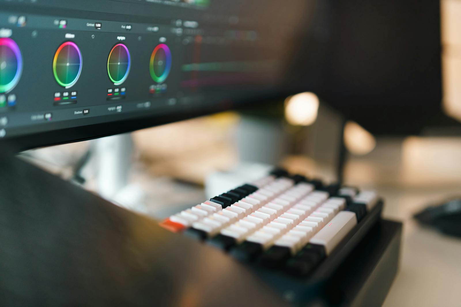
Checking text against a moving background, shot by shot, gets old fast. CutScore scans every title and caption against the footage behind it and flags the exact moments contrast drops too low.
What "enough contrast" actually means.
The number worth knowing: 4.5 to 1
Web accessibility guidelines (WCAG) put a useful stake in the ground: a contrast ratio of at least 4.5 to 1 between text and its background for normal text, and around 7 to 1 for small or thin type. You will almost never measure this exactly on moving footage, and that is fine. The point is the intent. White on light grey might be 1.5 to 1, which fails badly. White on a dark plate might be 12 to 1, which is comfortable on any screen. Knowing the target tells you which side of the line you are gambling on.
The fix that always works: a backing plate
If you take one thing from this, take this. A solid or semi-opaque box behind your text makes the contrast constant, no matter what the shot does behind it. The background can pan from a cave to a snowfield and your text never flinches, because it is no longer sitting on the footage, it is sitting on your plate. Even a soft drop shadow or a dark gradient at the bottom of the frame does most of the job. This is why broadcast lower-thirds and good captions almost always have a backing, and why the readable ones rarely use bare white text floating on the picture.
When you cannot use a plate: stroke and shadow
Sometimes a box looks heavy, or the style calls for clean text on the picture. Then your friends are a thin outline (a stroke) and a subtle drop shadow. A one or two pixel dark stroke around white text gives every letter its own little edge of contrast, so it survives a bright background. A soft shadow does the same trick from below. Use them together and even thin, elegant fonts stay legible. Just keep the stroke tasteful: a thick black outline turns your title into a ransom note.
Contrast is not the whole readability story
Contrast is the big one, but it works alongside two siblings. Size: if the font is tiny, even perfect contrast loses, which is why caption font size matters as much as colour. And placement: text that drifts under the platform's interface or off the edge of the frame fails for a different reason, which is the whole problem of where you put text so it is not cut off. Check all three together and your captions are genuinely readable, not just technically present.
Here is a real CutScore coaching report for an everyday video: on-screen text scored against the footage, with the low-contrast moments timestamped and the fix spelled out.
If you only fix three things.
Most contrast failures come down to these three. Fix them and your text reads on the worst screen your audience owns.
By eye, by ratio, or in one pass.
By eye, on the worst screen
Free and surprisingly good. Squint test, then a phone at arm's length on low brightness. The catch is consistency: you have to remember to do it on every text moment, and your eyes adapt fast. Best done cold, after a short break, on someone else's device if you can.
By measuring the ratio
Accurate but slow on video. You can sample the text colour and the background colour in any frame and run them through a contrast-ratio checker, aiming for 4.5 to 1 or better. Honest work, but the background changes every shot, so you are checking dozens of frames by hand. Most people will not.
With a coach in one pass
Hand the file (or a link) to CutScore. It scans your on-screen text against the footage behind it, flags the moments contrast drops below readable, and tells you which shots need a plate, a stroke, or a bigger font, with timestamps. See a sample report.
Frequently asked.
Make sure every word is readable.
CutScore checks your on-screen text against the footage behind it and tells you exactly which shots need a fix, with the evidence to back it up. Join the waitlist for early access.
You’re on the list.
We’ve noted your email. You’re in line for priority access and a free report when early access opens.